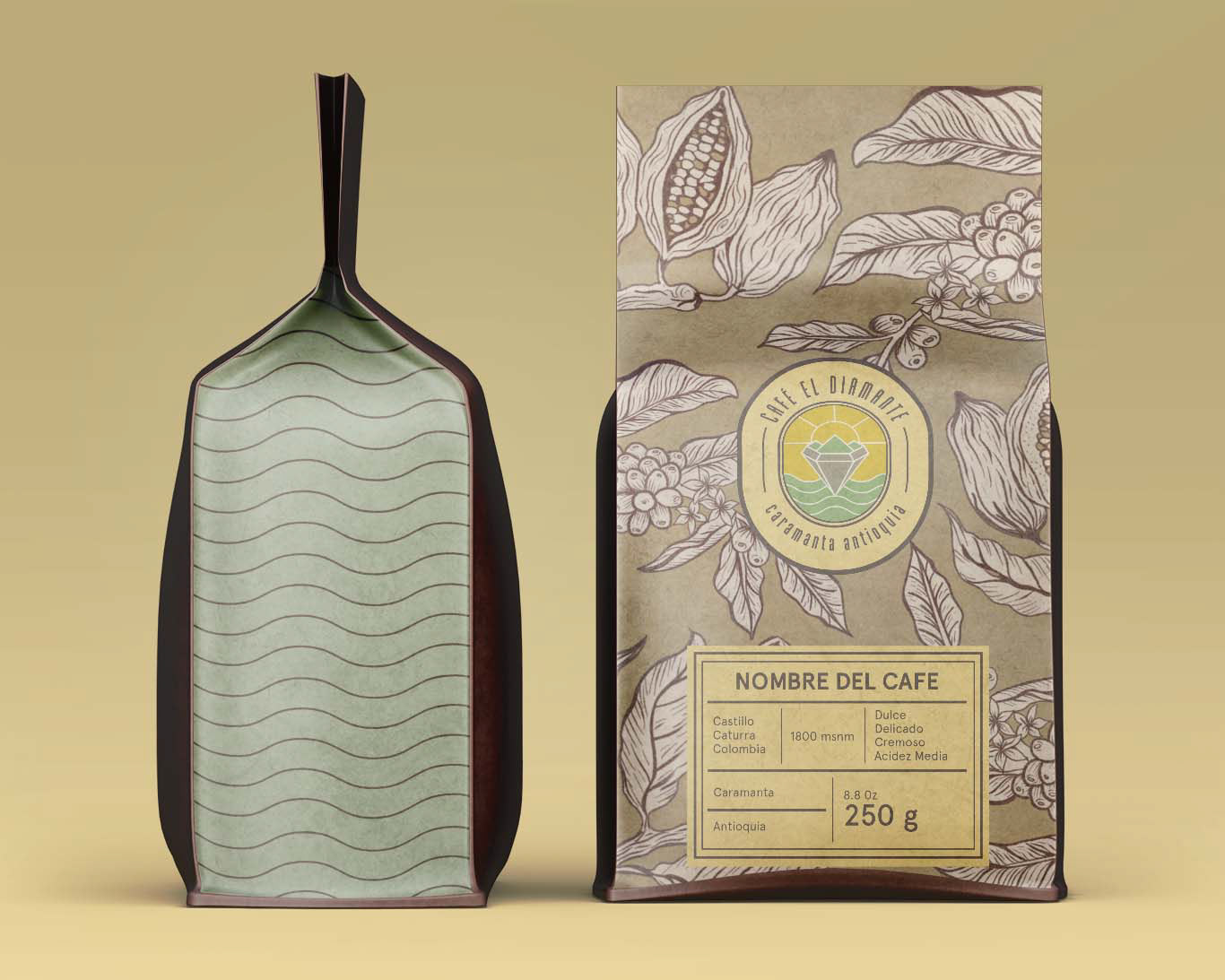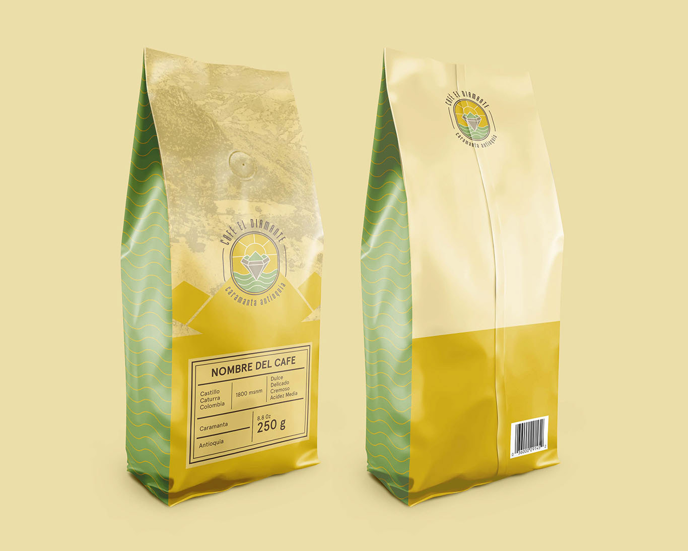
Project: Brand Identity & Packaging
Client: Cafe el Diamante, Antioquia Colombia
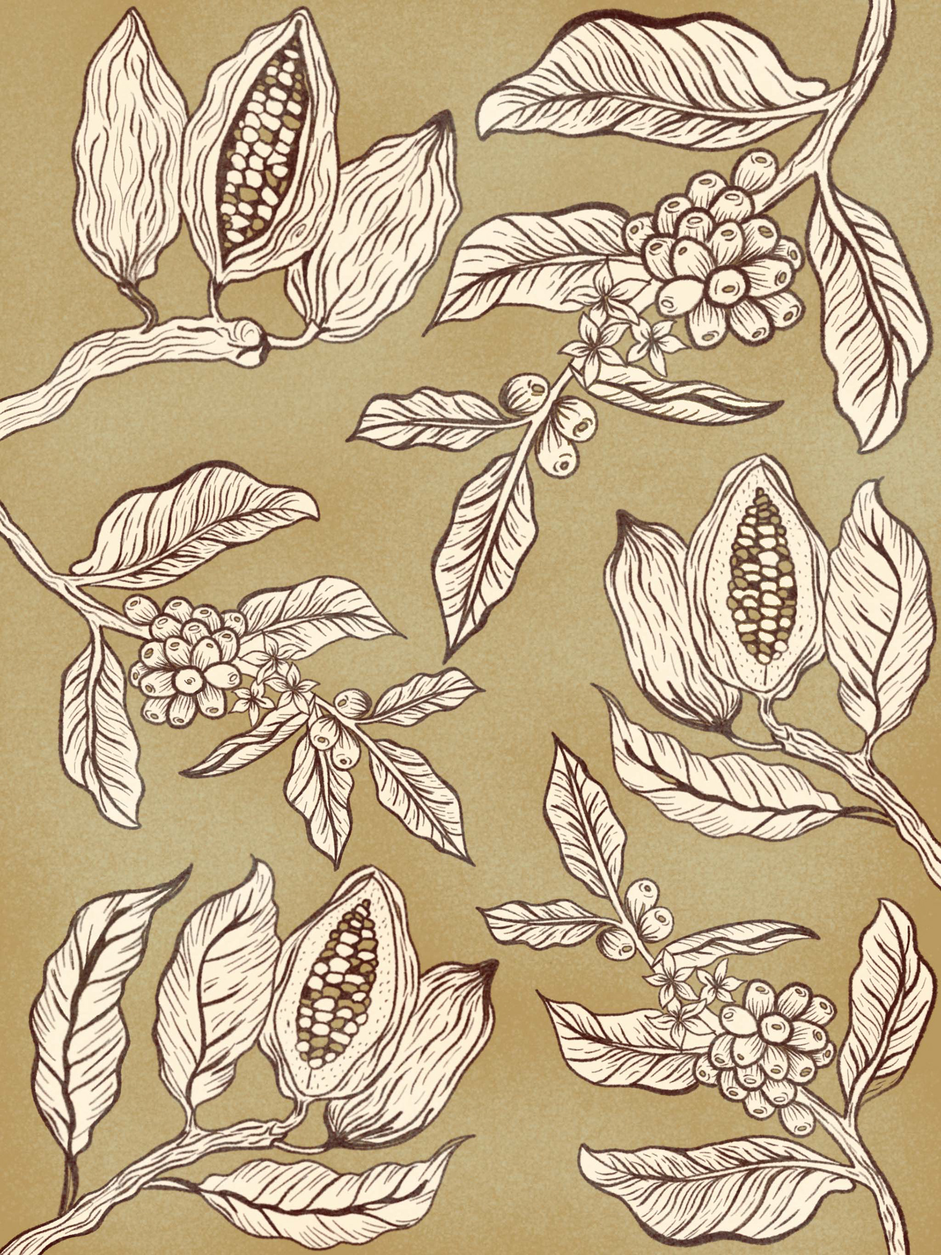
Illustrator | Indesign | Photoshop | Procreate
_________
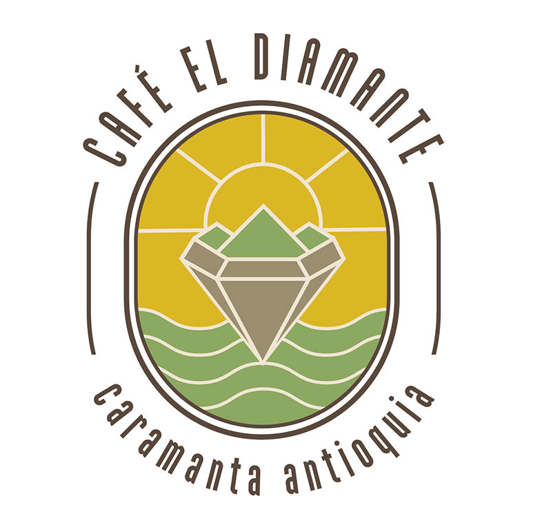
The geometric shape of the diamond and Sebastian's favorite coffee pot is the graphic inspiration for the logo. The shape of the logo is created by the sum of the mountain + the diamond, located in the center of the logo, above the diamond, the sun, evoking the energizing, stimulating, and revitalizing qualities of coffee. At the bottom of the diamond, we see wavy lines that symbolize the land and its roots, tradition, and family union, as the last one mentioned is one of the most important values of the brand. The oval shape that surrounds the logo refers to the shape of the coffee, without having to show the coffee fruit graphically. The logo line is durable since it can be applied to an endless number of applications.
one of the brand strategies relies on the logo colors, while the color Green symbolizes balance, reliability, natural and organic, and brown represents agriculture, family tradition, and trust. The client wanted something different that stands out from the rest of the competition both in Colombia and worldwide since the brands seen on the outside use red, green, and blue colors. In this case, yellow awakens the senses, generates happiness, energy, kindness and is finely combined with brown representing family roots and tradition.