Project: Rebrand Identity
Client: Ceres
Illustrator | Photoshop | Procreate
_________
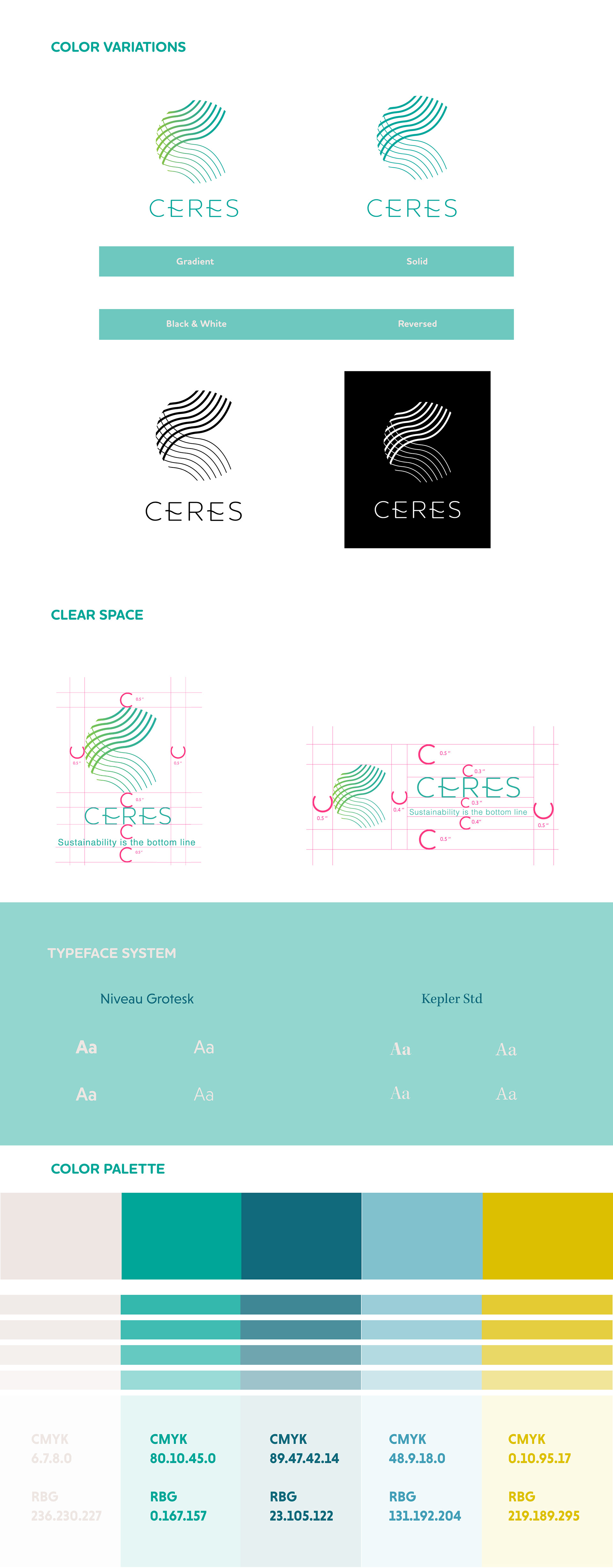
The big idea for this re-brand is “the pursuit of global environmental sustainability”. The mission is to “transform people thought's about the need to create a sustainable and stable world”. The inspiration for Ceres is an organic aesthetic with clean and contemporaneous energy; the letter-forms expose harmony and rhythm between the elements transmitting a well-balanced structure between shapes and letterforms.
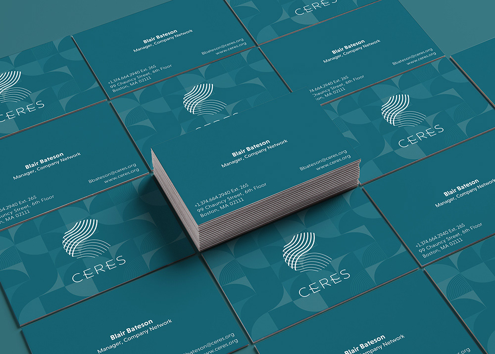
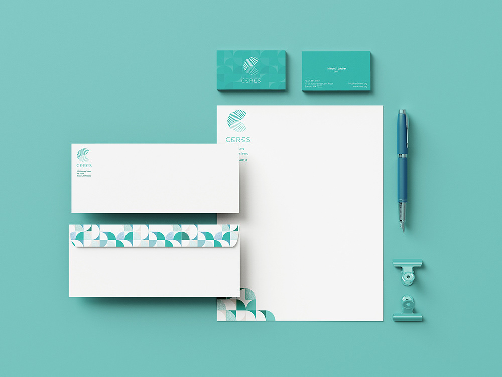
The logo is fresh, modern vibe, organic and rhythm conveying the natural essence and harmony of our environment, as well as the integration natural elements that the brand emphasizes: water, air and earth.
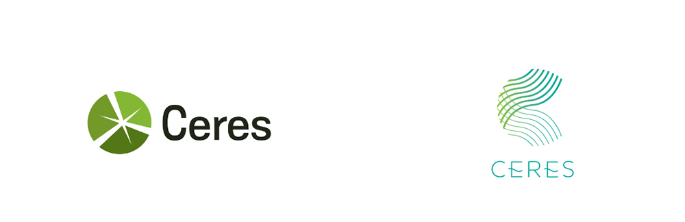
Old Logo | New Logo
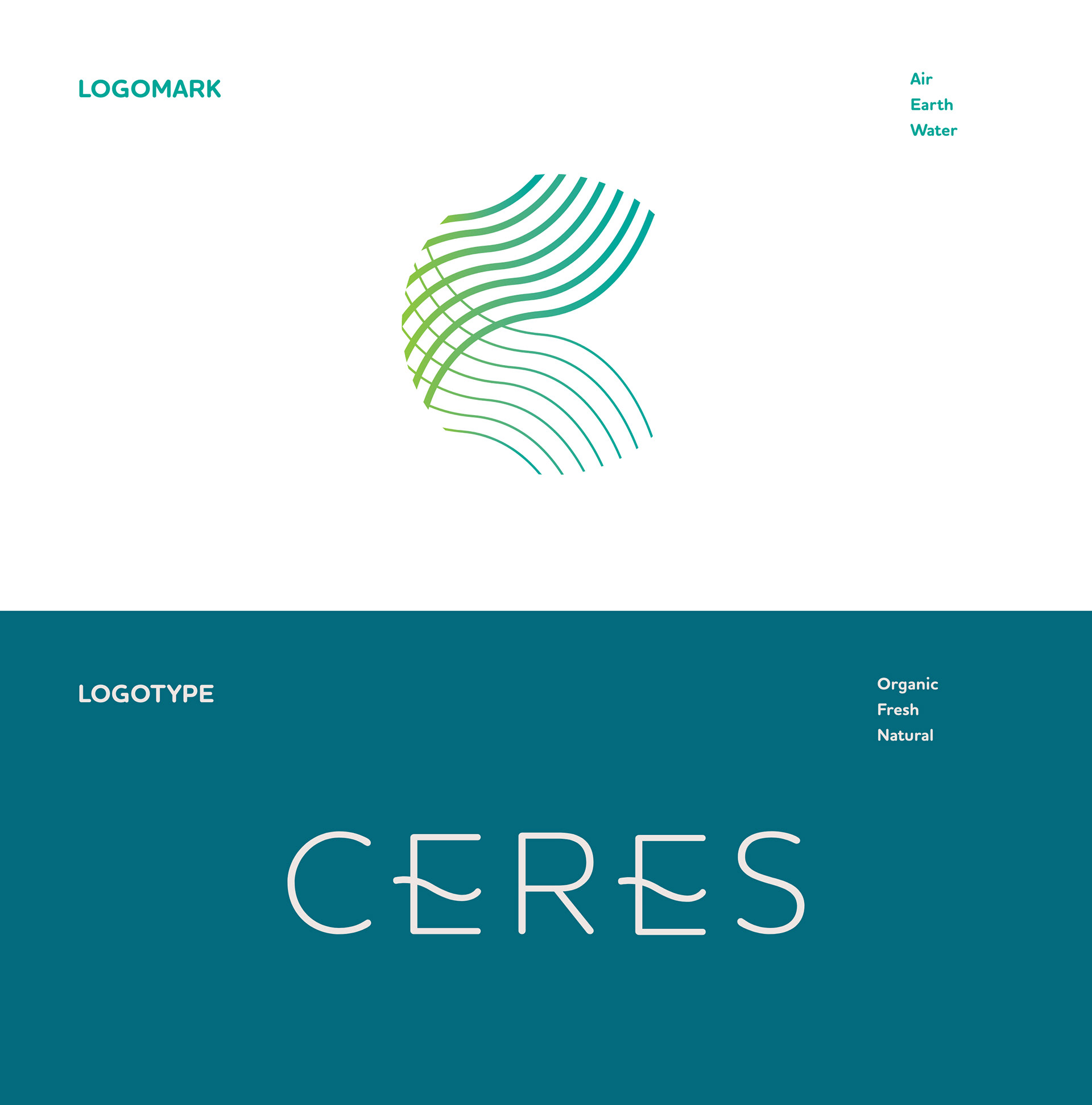
The colors used are vibrant and inspiring. The teal brings confidence and trust, the lime green conveys environment and new beginnings.
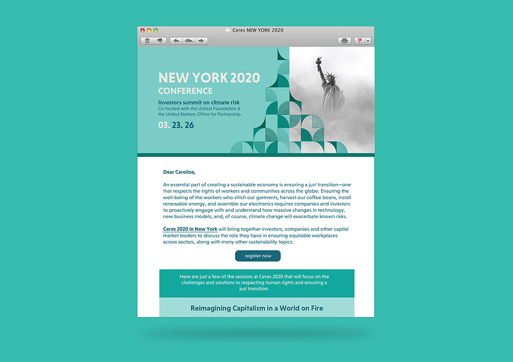
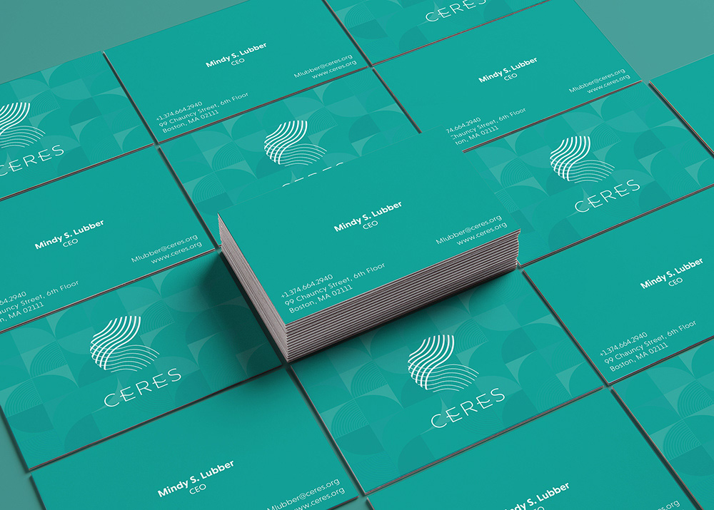
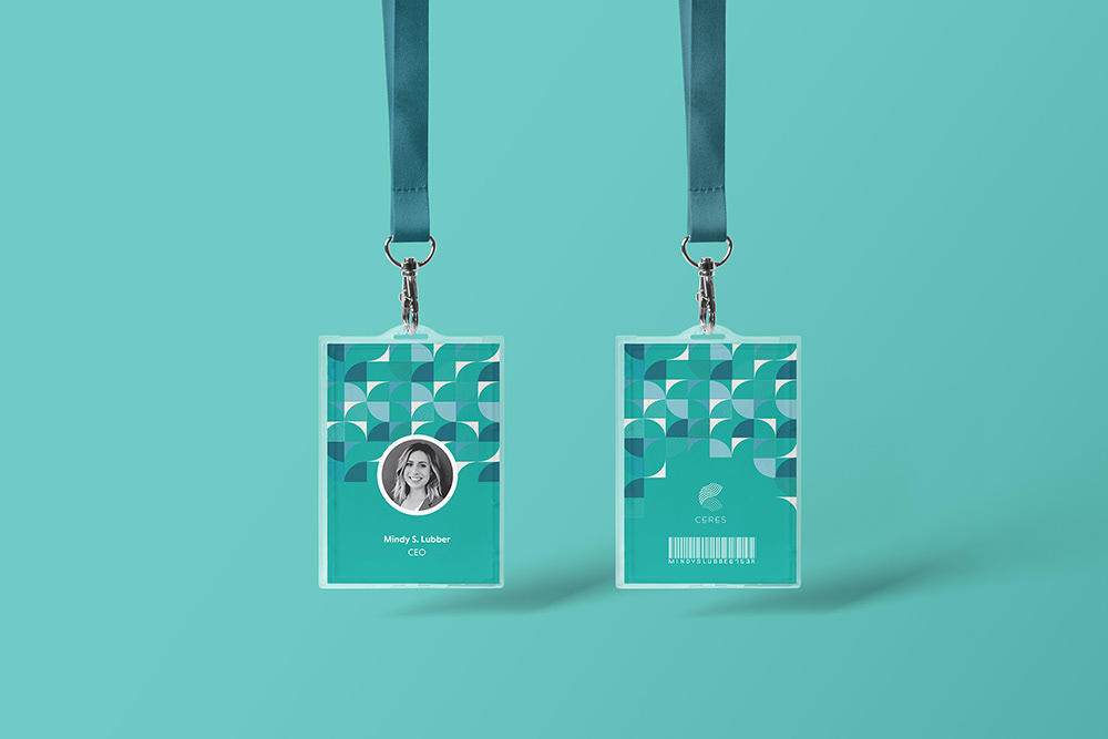
Newsletter | Stationery | Id Badge